# column 그래프 그리기(필수) >>> plt.figure(figsize=(20, 7)) # 그래프 크기(가로, 세로) >>> runner_state = sns.countplot('State', data=USA_runner) # 그래프 함수 : sns.countplot() 사용 # column 그래프 부가 설명(옵션) >>> runner_state.set_title('Number of runner by State - USA', fontsize=30) # 제목 >>> runner_state.set_xlabel('State', fontdict={'size':16}) # x축 이름 >>> runner_state.set_ylabel('Number of runner', fontdict={'size':16}) # y축 이름 >>>plt.show() # column 그래프 그리기(필수) >>> plt.figure(figsize=(20, 10)) >>> runner_state= sns.countplot('State', data=USA_runner, hue='M/F', palette={'F' : 'y', 'M' : 'b'}) # hue: columns명 기준으로 데이터를 구분 # palette: 색상 (y: 노랑, b: 파랑) #column 그래프 부가 설명(옵션) >>> runner_state.set_title('Number of runner by State - USA', fontsize=30) # 제목 >>> runner_state.set_xlabel('State', fontdict={'size':16}) # x축 이름 >>> runner_state.set_ylabel('Number of runner', fontdict={'size':16}) # y축 이름 >>>plt.show()
▶ Dual Axis, 파레토 차트
>>> fig, barChart = plt.subplots(figsize=(20,10))
# bar에 x, y값 넣어서 bar chart 생성 (파랑) >>>barChart.bar(x, y)
# line chart 생성 (초록, 누적 값) >>>lineChart = barChart.twinx() # twinx() : 두 개의 차트가 서로 다른 y 축, 공통 x 축을 사용하게 해줌 >>>lineChart.plot(x, ratio_sum, '-g^', alpha = 0.5) # alpha:투명도 # -: 선 # ^: 세모, s : sqaured, o : circle # g : green, b: blue, r: red
# 오른쪽 축(라인 차트 축) 레이블 >>>ranges = lineChart.get_yticks() # y차트의 단위들 >>>lineChart.set_yticklabels(['{0:.1%}'.format(x) for x in ranges]) # 0.1% : 소수점 첫 째자리 까지 표현 # 0.2% : 소수점 둘 째자리 까지 표현
# 라인차트 데이터 별 %값 주석(annotation) >>>ratio_sum_percentages = ['{0:.0%}'.format(x) for x in ratio_sum] >>>for i, txt inenumerate(ratio_sum_percentages): lineChart.annotate(txt, (x[i], ratio_sum[i]), fontsize=12)
# x, y label만들기 >>>barChart.set_xlabel('Age', fontdict={'size':16}) >>>barChart.set_ylabel('Number of runner', fontdict={'size':16})
# plot에 title 만들기 >>>plt.title('Dual Axis Chart - Number of runner by Age', fontsize=18)
>>>plt.show()
▶ Pie chart
>>> plt.subplots(figsize=(7,7))
# pie chart 만들기(차트 띄우기, labels 달기, 각 조정, 그림자, 값 소숫점 표시) >>>plt.pie(marathon_2015_2017['M/F'].value_counts(), explode=(0, 0.1), labels=labels, startangle=90, shadow=True, autopct='%.2f')
# 라벨, 타이틀 달기 >>>plt.title('Male vs Female', fontsize=18)
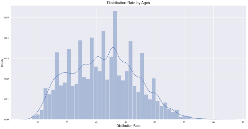
# label과 title 정하기 >>>plt.xlabel('Age', fontsize=30) >>>plt.ylabel('Official Time(second)', fontsize=30) >>>plt.title('Distribution by Running time and Age', fontsize=30)